Overview
My Role
Timeline
Market Research
User Research
Usability Testing
User Evaluation
Paper Prototyping
Low-fidelity Prototyping
Project Management
Software Development
September - December 2022 (13 weeks)
Tools
Team Size
Figma
Mural
HTML, CSS, and Javascript
React
APIs
Google Workspace
4
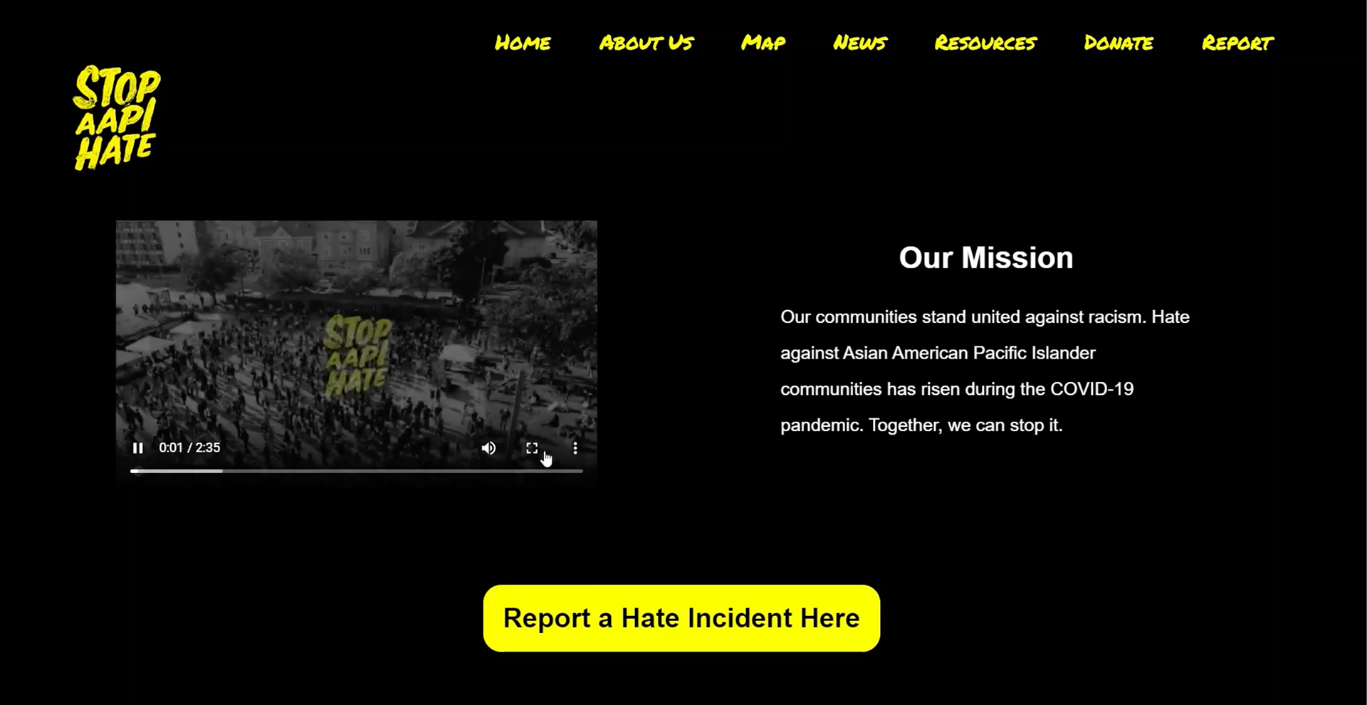
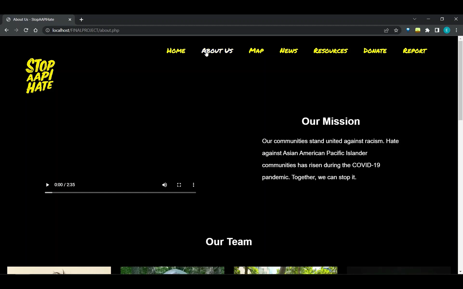
The Problem
In recent years, AAPI hate has been exponentially increasing alongside Covid-19 cases. The purpose of the Stop AAPI Hate website is to allow people to report and track AAPI hate crimes in order to hold perpetrators accountable. This website will serve as a database, documenting up to date news about the AAPI community and crimes against it. It will also be a resource that people can go to learn more about the AAPI community and its history. People will also be able to donate to organizations helping this movement on the website. All movements start with a centralized database of some sort whether that be a website or some other platform. This website will serve to document events in order for them to not be forgotten as well as propel the Stop AAPI movement forward. Crimes against the AAPI community will not be overlooked any longer.
The purpose of the Stop AAPI Hate website will be to prevent future AAPI hate crimes through 4 main features:
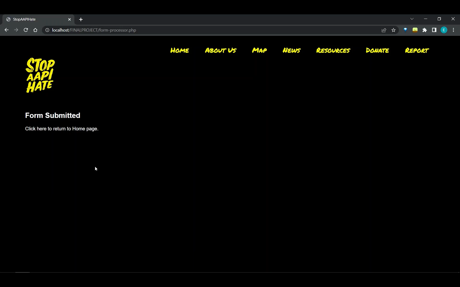
1. A form to help people report hate crimes that will track the location, time, and events of the crime
2. An interactive map documenting AAPI hate crimes nationwide
3. Educational resources to inform the public about AAPI heritage and history
4. Links to donate to organizations in support of the Stop AAPI Hate movement
Competitive Analysis
After conducting some market research, we found a Stop AAPI hate website that already exists, https://stopaapihate.org/. Therefore, instead of completely designing our website from scratch, we decided to redesign the current website to make it more user-friendly and intuitive.
User Research - Poll
Survey Responses
Survey Insights
1. A majority of respondents have witnessed an AAPI hate crime before
2. Out of that group, 78.6% of them didn't report it
3. 100% of respondents rated the current processes for reporting AAPI hate crimes 3/5 or lower in terms of effectiveness because of the following reasons:
• They are uninformed about ways to properly report an AAPI hate crime
• They don't think their report will have an impact or result in consequences
• They think their report will be dismissed by police and legislators
4. Responders think the current processes for reporting hate crimes could be improved through:
• Increased awareness for ways to report AAPI hate crimes
• More acknowledgement and support from police and federal/state politicians
• Ways to report hate incidences that are not criminal offenses
• Increased exposure to AAPI culture overall
5. Responders think the current press release coverage on AAPI hate could be improved through:
• Increasing visibility
• Increasing coverage
• More stories about allies helping the AAPI community
• Make stories bigger and more urgent
• More resources connected to press releases
Interviews + Usability Testing
We interviewed 7 people who were pre-screened to meet the requirement of being in support of stopping AAPI hate. Along with the interviews, we conducted usability testing on stopAAPIhate.org. We asked participants to report an incident on the site. We asked them questions during the process and had follow up questions.
New Insights from Interviews
Ways to prevent AAPI hate:
• More awareness of how much AAPI bias is not reported and the impacts of underreporting
Features that should be added:
• Facts about the importance of reporting on sight
• One web page for inputting responses
What respondents don't want:
• To be asked for their personal information
• Sign up for the site, sign up for the newsletter
Users' Pain Points for stopAAPIhate.org:
• Website design was hard to navigate
• Lacked clear direction of where to report
• Broken links are present throughout the site
Evaluation
We then evaluated which solutions we could implement that would add the most user value and require the least effort for organization. We came up with the following solutions we could implement:
• Streamlining the tool bar
• Making the interface easier to use, more user-friendly, and more elegant
• Creating a simplified and more concise reporting form
• Making the reporting form highly accessible and visible from the home page
• Creating an interactive map that would show the location and details of each AAPI hate crime reported on the website (useful for pressuring police and legislators to push policies to decrease crimes in areas where AAPI hate incidences are heavily reported)
• Creating a page where AAPI hate + AAPI culture and history resources are centralized and the user can filter the page based on what they want to see
• Creating a page where recent, trending, and featured news is shown
• Creating a page populated with links to donate
User Evaluation - Card Sorting
I conducted five card sorting sessions with potential users to get a sense of how to organize the website to make it as intuitive as possible.
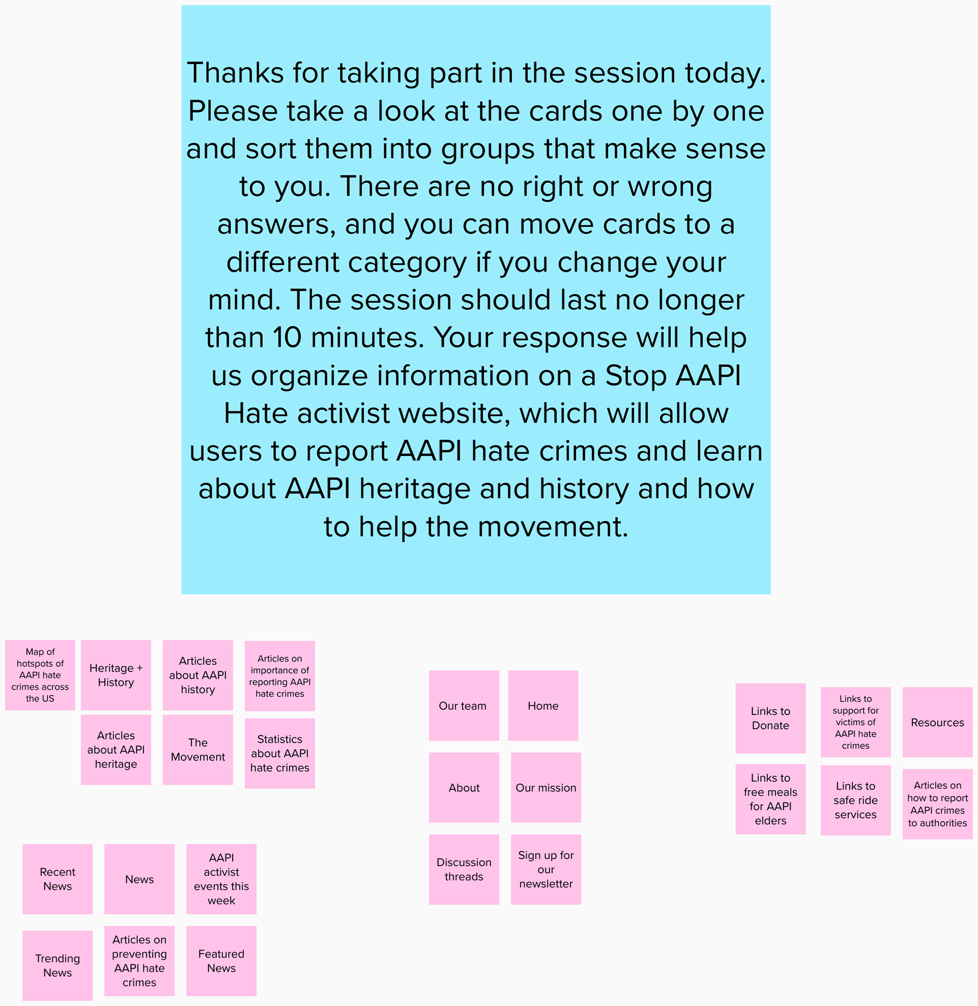
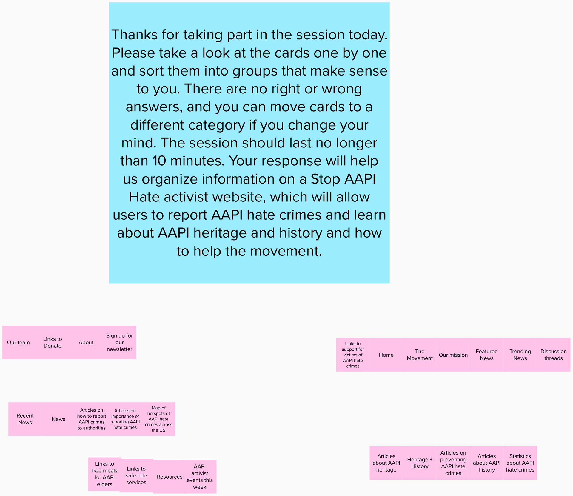
Paper Prototyping
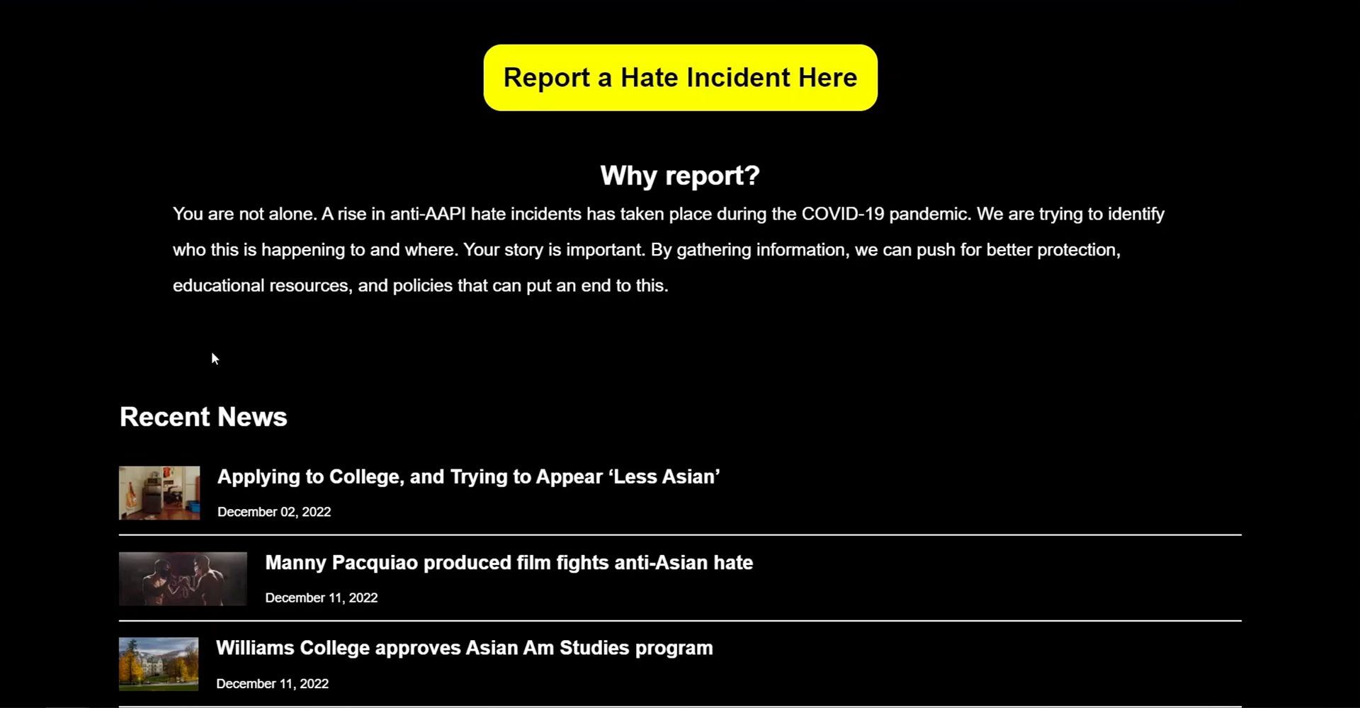
Based on responses generated from the survey, we created a paper prototype and made the features most commonly labeled as "extremely important" accessible from the home page of the website. These features include the form to report hate crimes and the map of hotspots for AAPI hate crimes.
Low-Fidelity Prototype
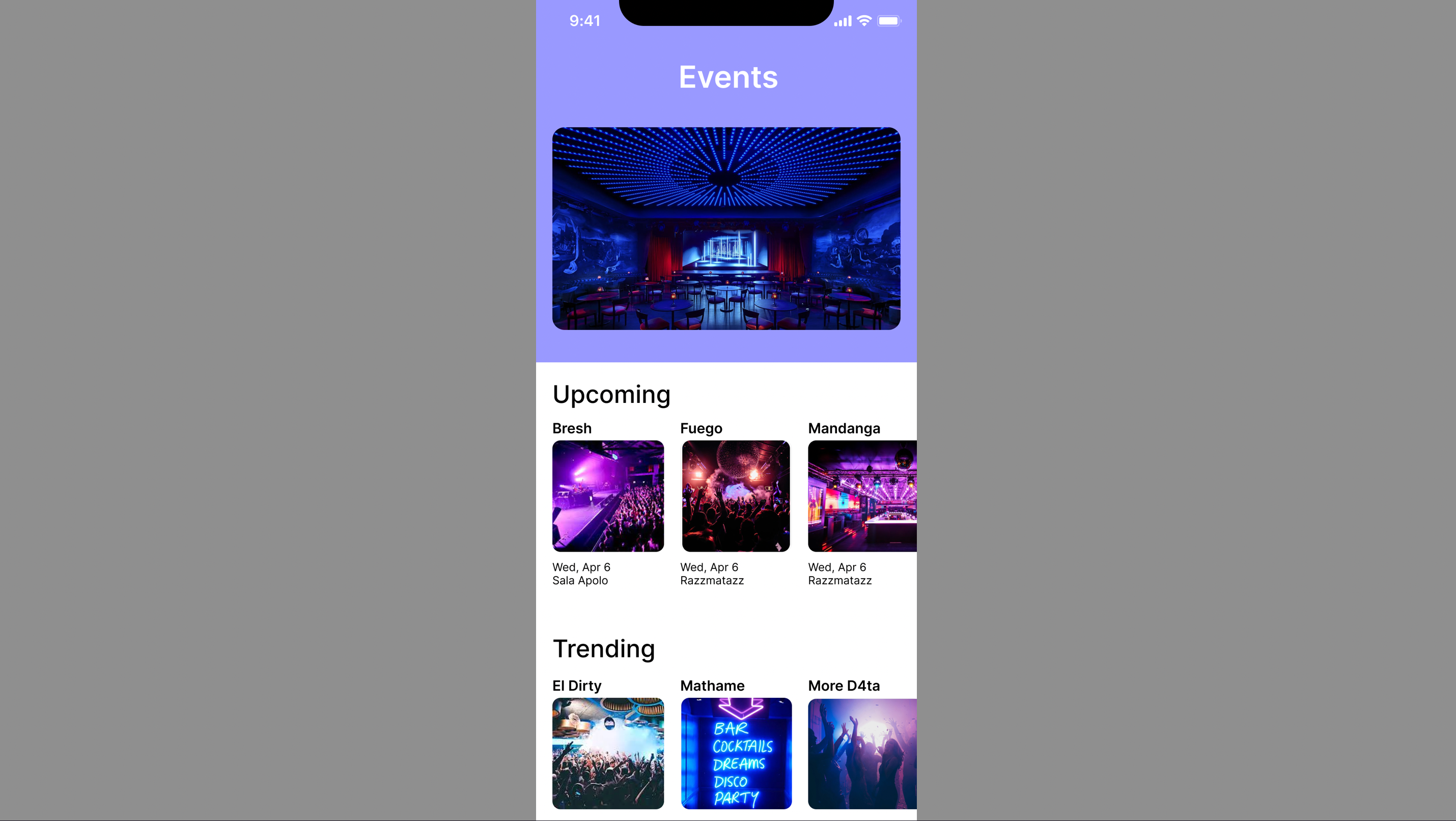
Home Screen
On the original website, it is difficult to locate the reporting form because it's not on the home screen and the navigation menu is cluttered with 10 items. It also takes 3 clicks to access the reporting form from either the home page or the navigation menu. The similar wording of the menu items is also confusing. For example, "Reports" and "Media" are separate menu items and "Press Releases" and "News" are also separate sub-items under Media. This organization makes the menu items difficult to distinguish from each other.
Solutions implemented:
• Streamlining the tool bar
• Making the interface easier to use, more user-friendly, and more elegant
• Making the reporting form highly accessible and visible from the home page
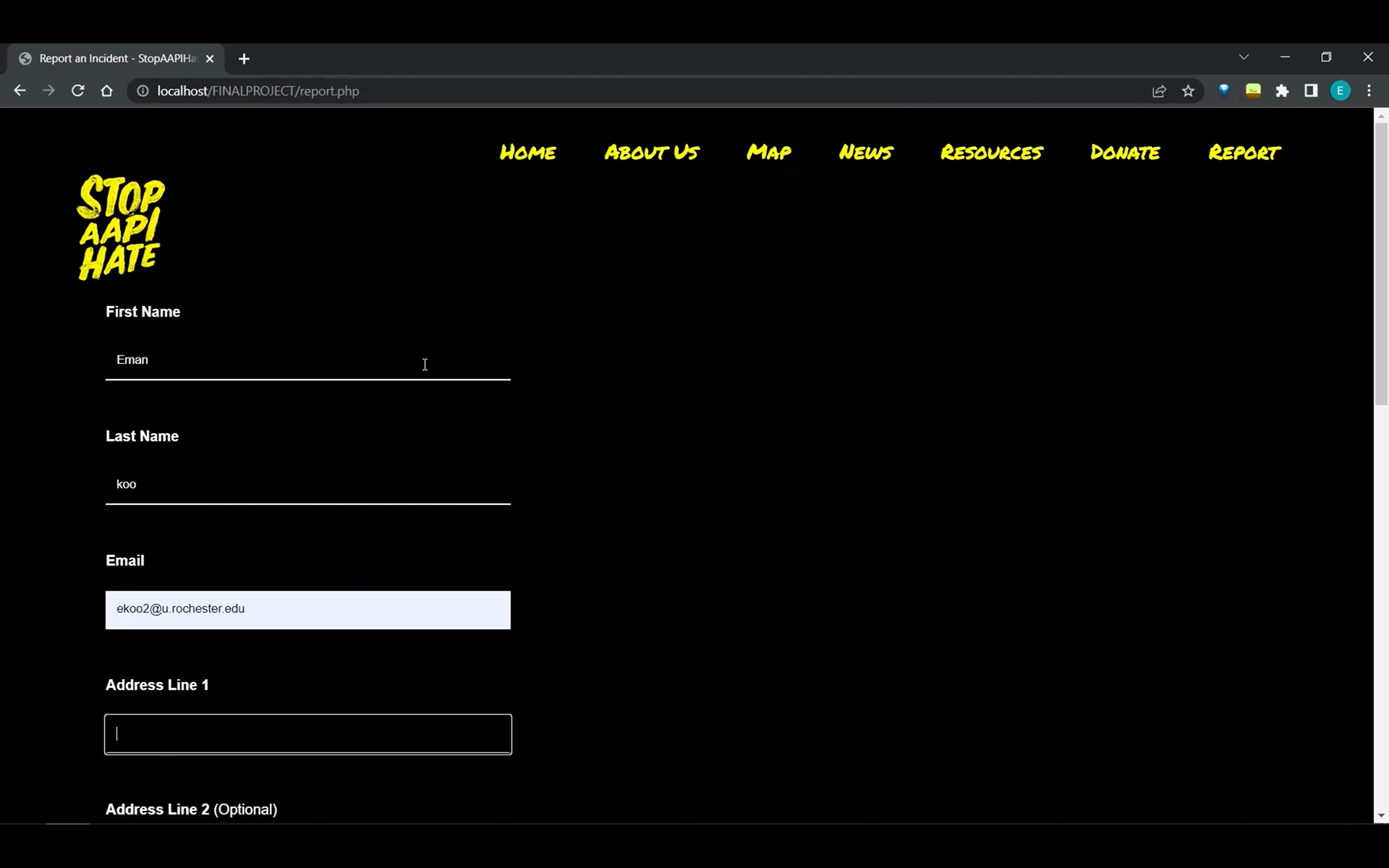
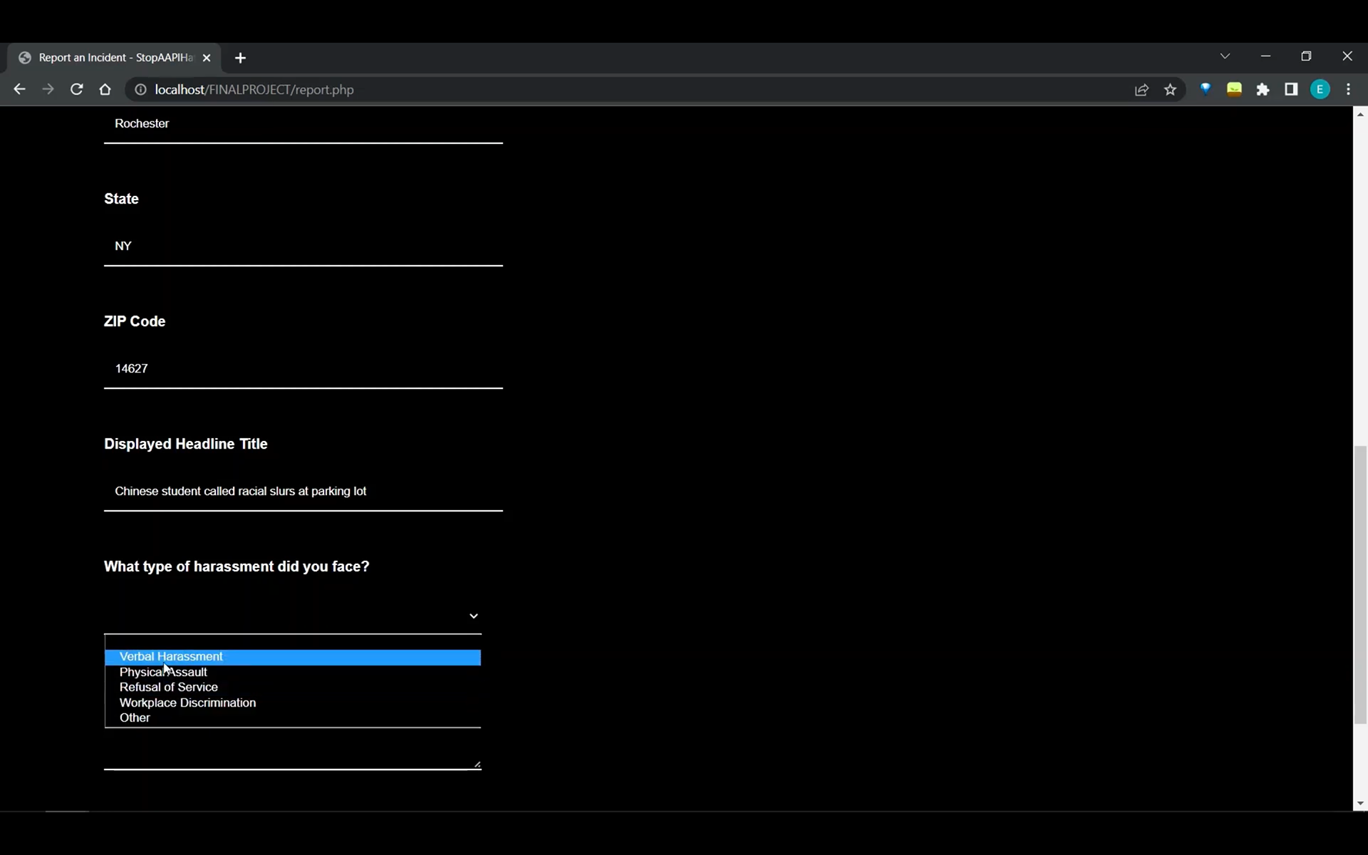
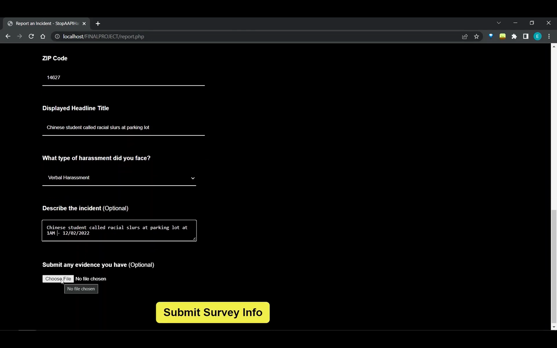
Reporting Page
The reporting form was extremely long, repetitive, and required a lot of confidential information such as the city you live in and your zip code. There were also no indications of which questions required a response as well as how many questions were in the form.
Solutions implemented:
• Creating a simplified and more concise reporting form
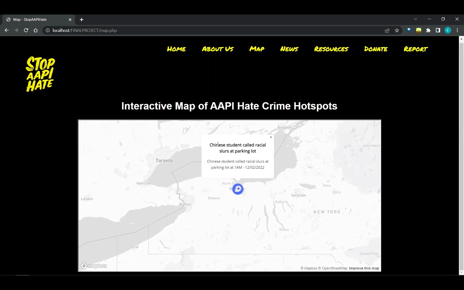
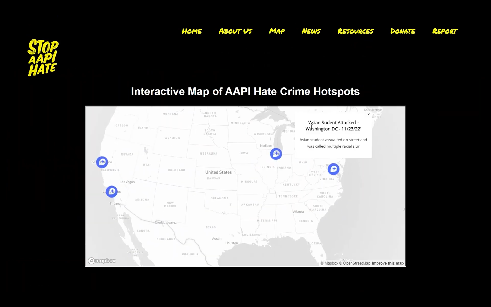
Interactive Map
On the original website, it is difficult to see the utility of the reporting form since reports aren't made public and only an annual report summarizing all hate incidences recorded by the website is shown. Since, many of our survey respondents expressed this same concern, that they don't think their report will have an impact or result in consequences, we decided to address this pain point with our interactive map. This feature will drop a pin on the location of every AAPI hate crime reported on the website. It will also show details of the incidence when hovering over it on a map. This feature will also be useful for pressuring police and legislators to push policies to decrease crimes in areas where AAPI hate incidences are heavily reported.
Solutions implemented:
• Creating an interactive map that would show the location and details of each AAPI hate crime reported on the website
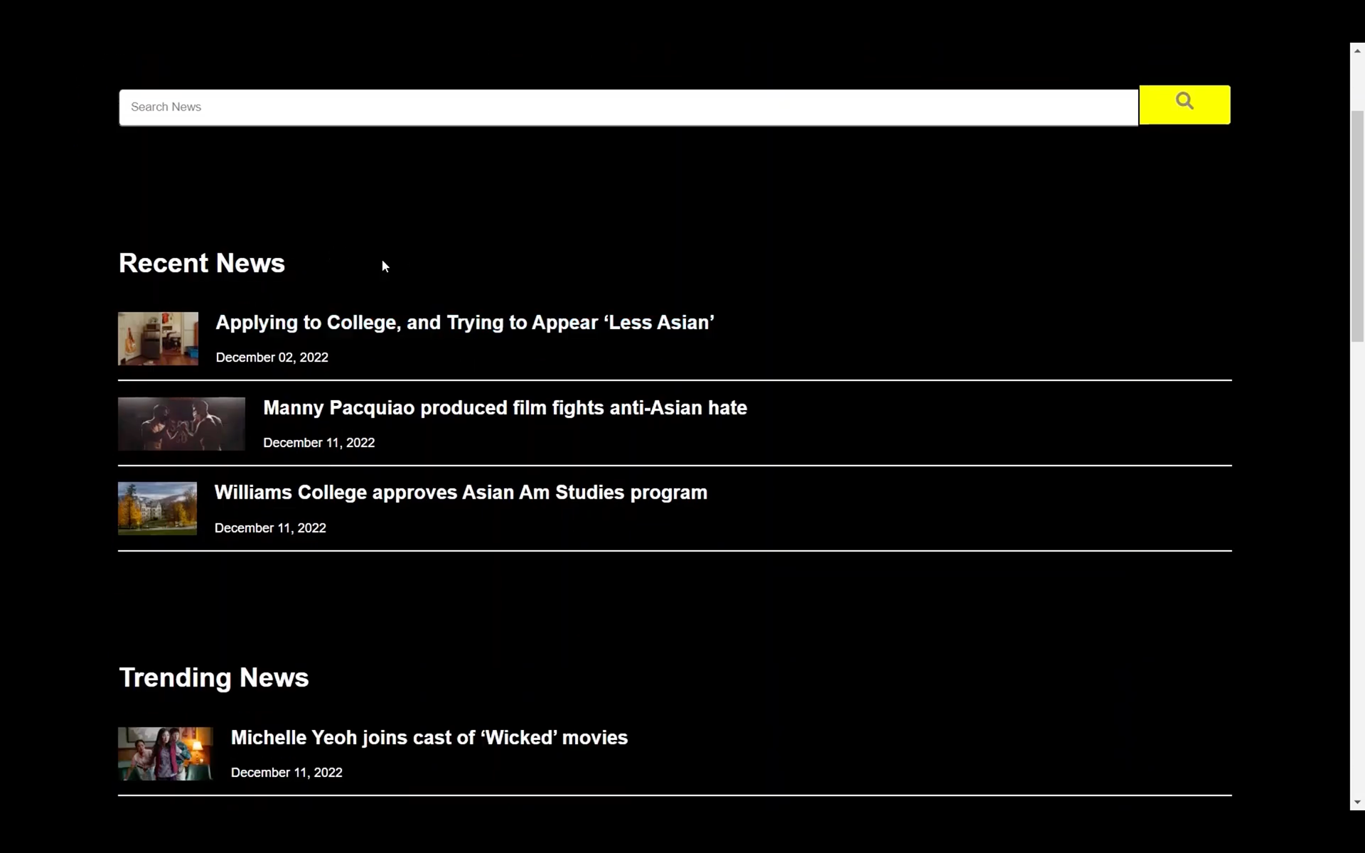
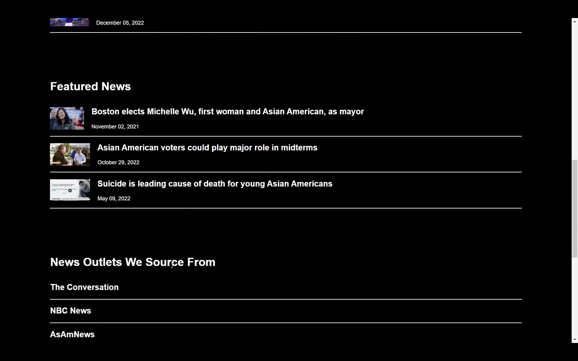
News Page
On the original site, the sub pages, "press releases" and "news", cannot be assessed on the same page. The links are also unsorted, shown in one long, continuous list. On our News page, we decided to sort the links by "Featured News," "Trending News," and "Recent News." We also implemented a search bar to make it easier to navigate the page.
Solutions implemented:
• Creating a page where recent, trending, and featured news is shown
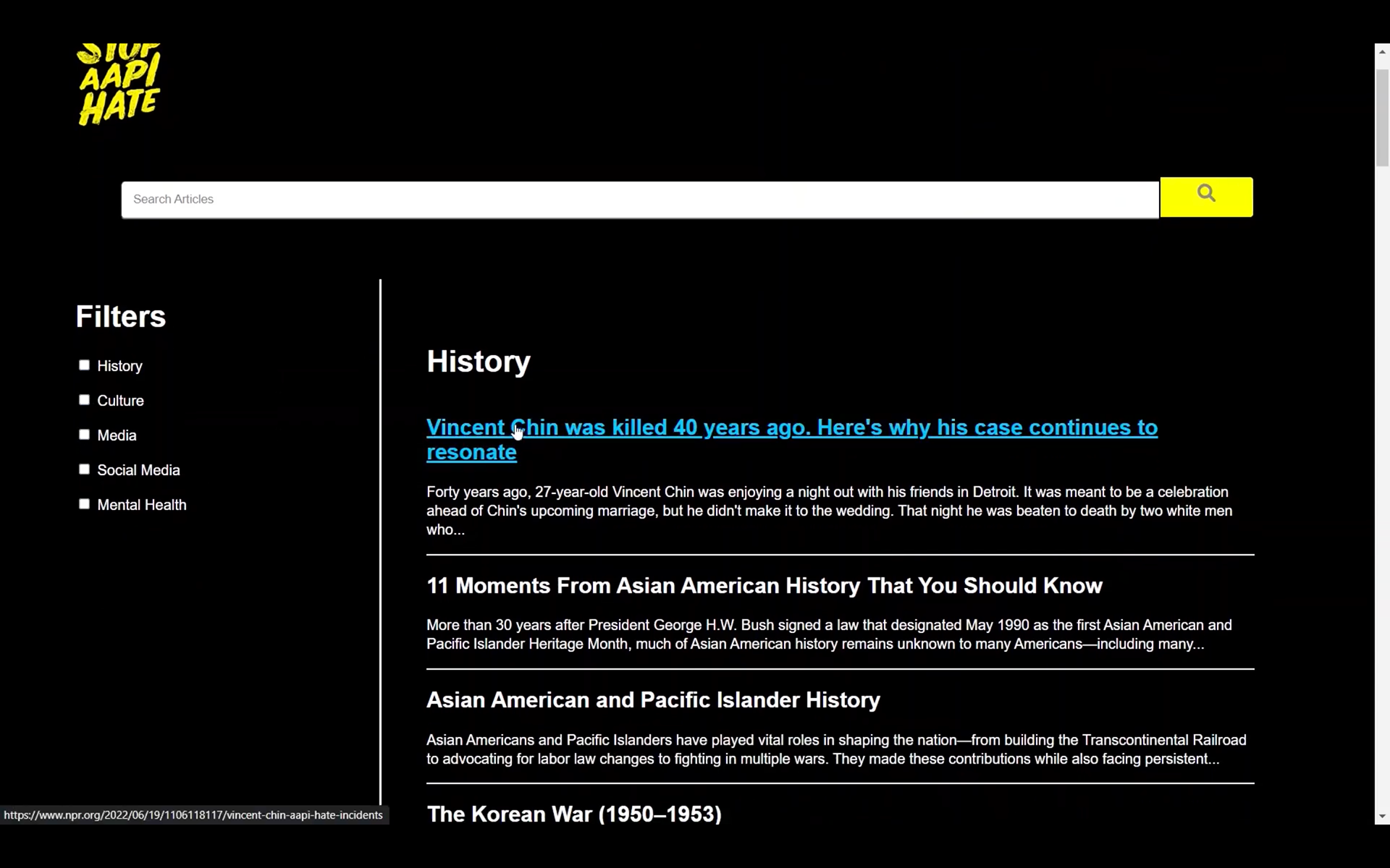
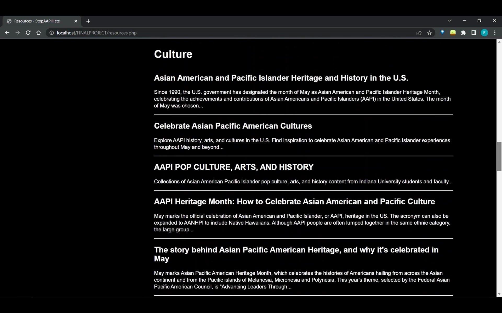
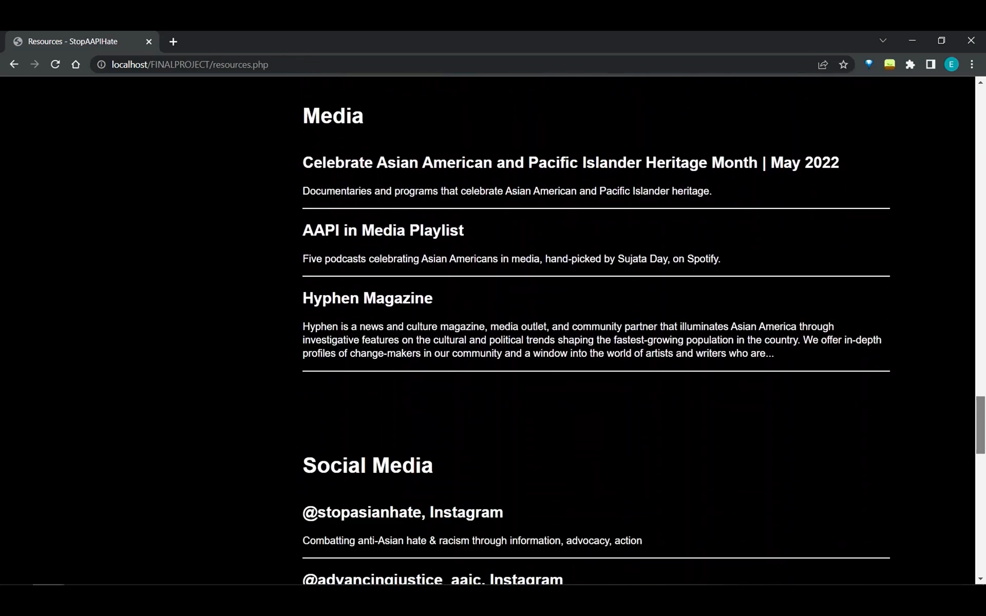
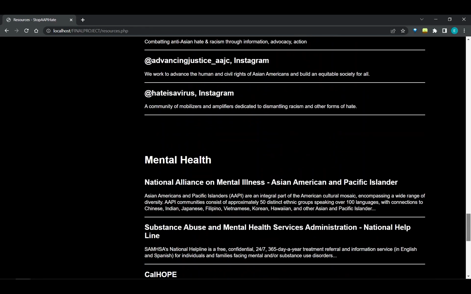
Resources Page
On the original site, 'act now,' 'resources', and 'store' are all shown as sub pages under Act Now. The resources page doesn't provide resources to learn more about AAPI culture and history. It was difficult to navigate the page as there were 7 categories and each one had several sub-categories that you would have to click to access the links. On our site, we decided to organize resources under 5 categories: culture, history, media, social media, and mental health. We also implemented a filter where users could find specific resources in the category they're interested in.
Solutions implemented:
• Creating a page where AAPI hate + AAPI culture and history resources are centralized and the user can filter the page based on what they want to see
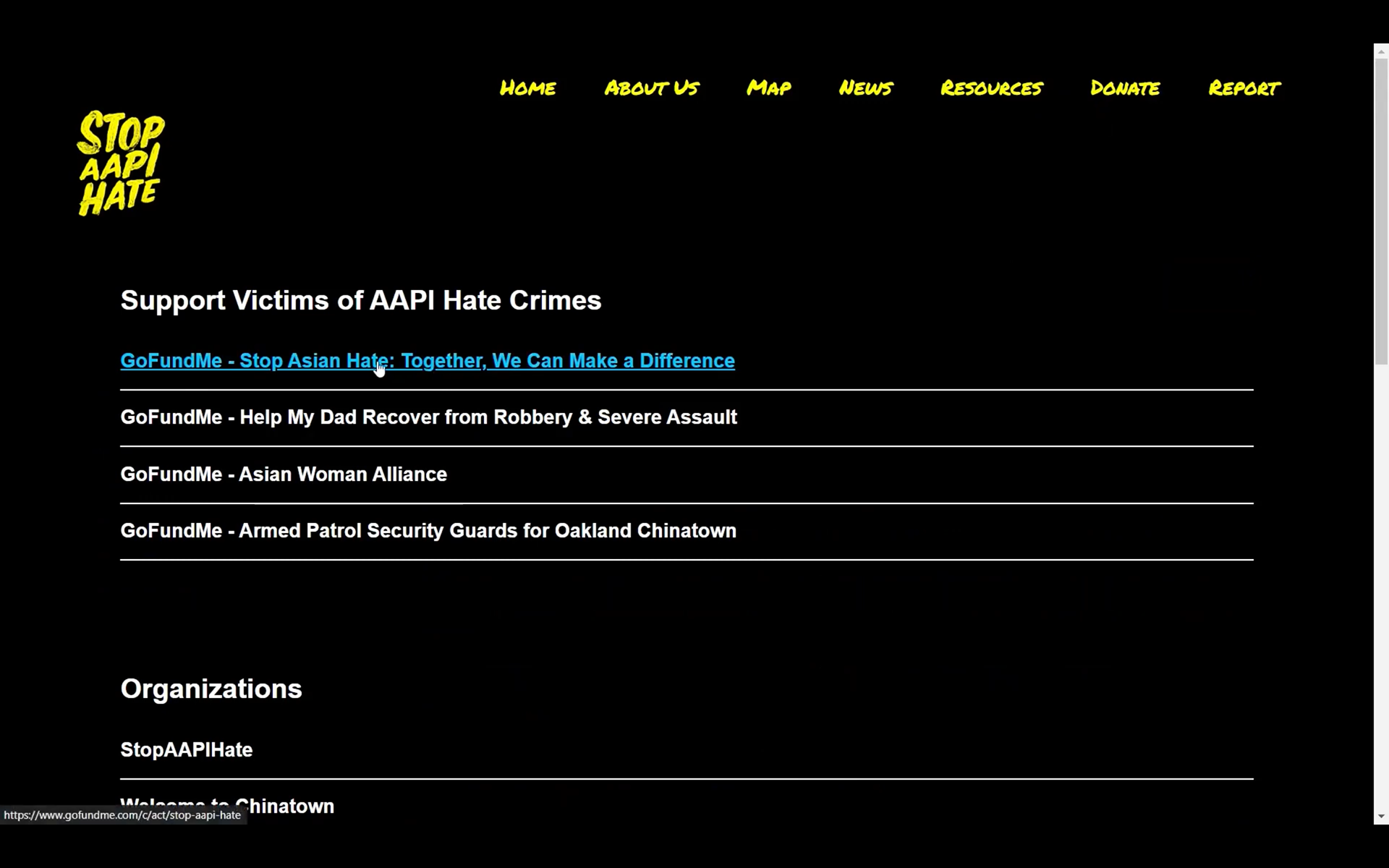
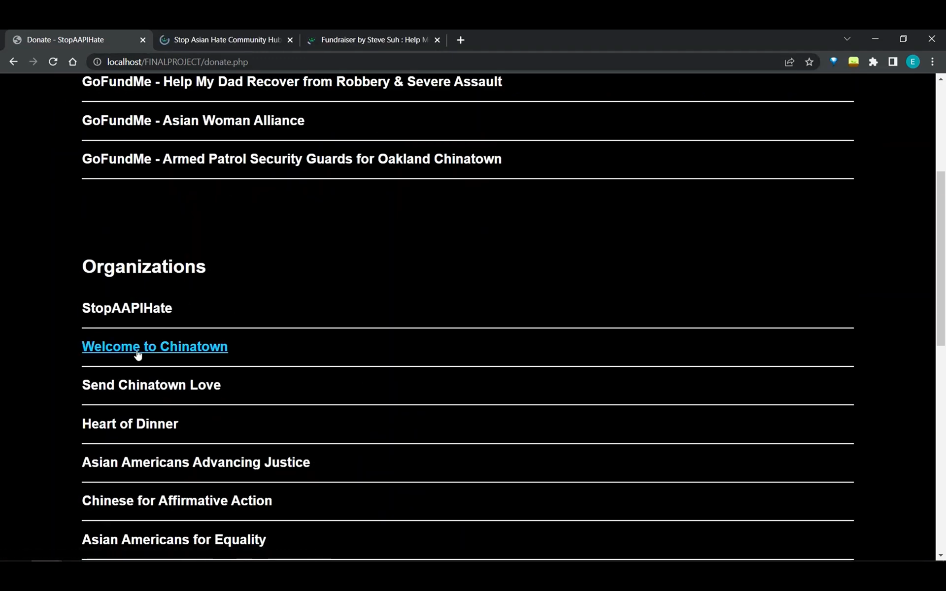
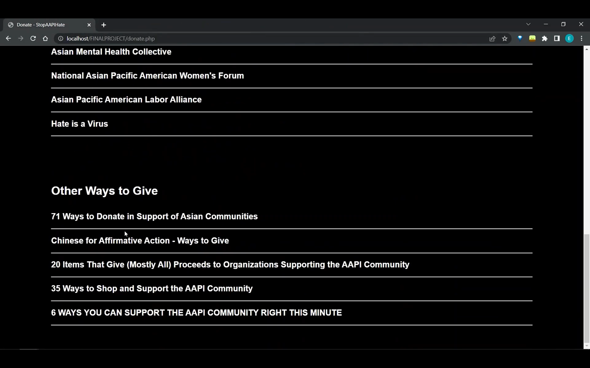
Donate Page
The original website only provides one organization you can donate to. We populated our donate page with more than 30 oraganizaitons you can donate to as well as ways you can donate to victims of AAPI hate crimes.
Solutions implemented:
• Creating a page populated with links to donate
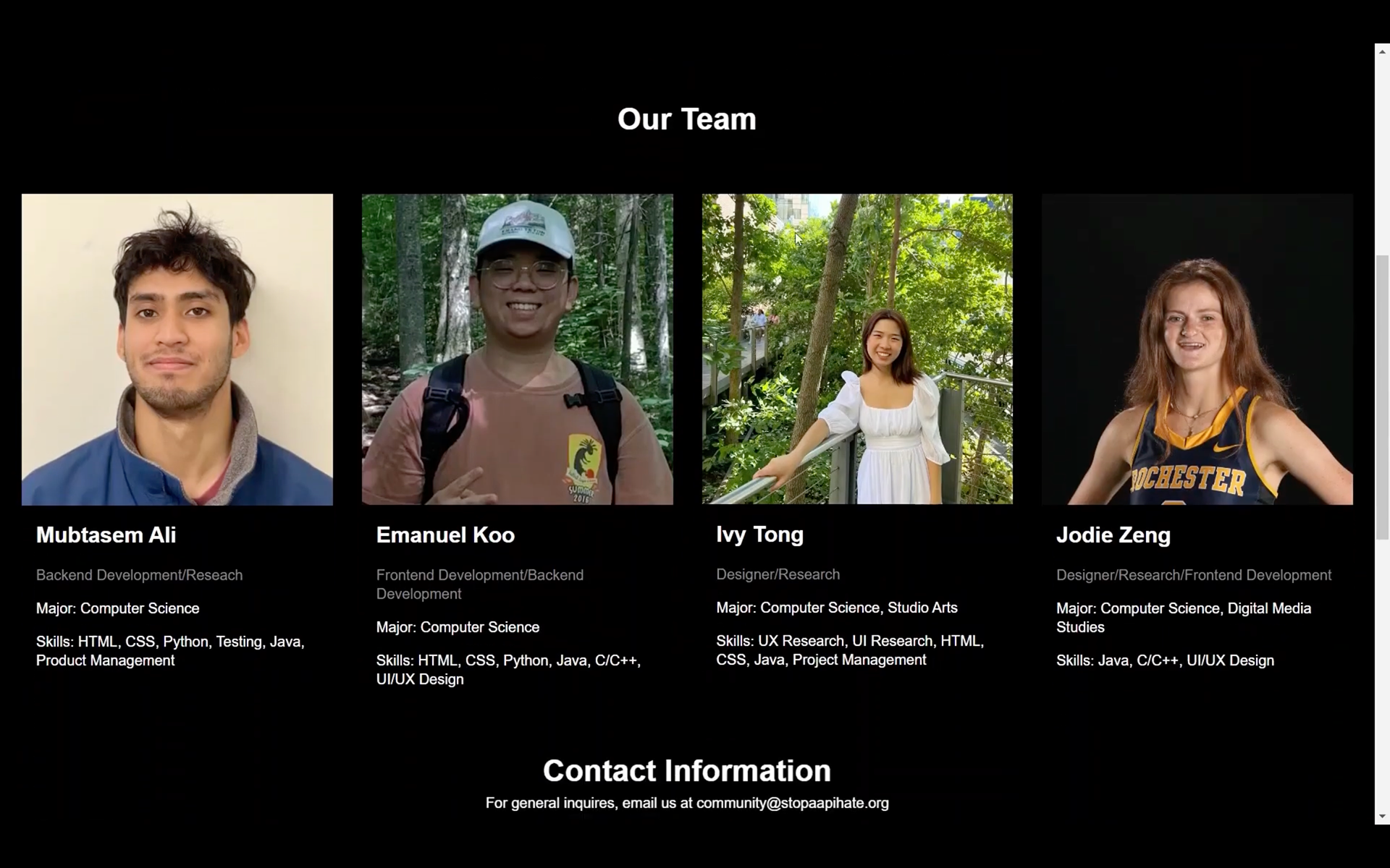
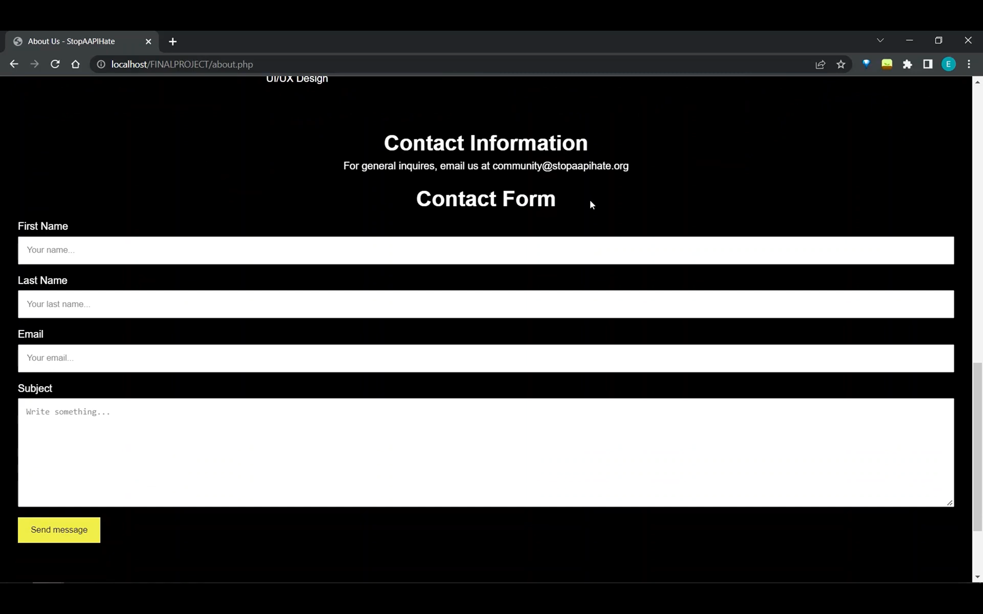
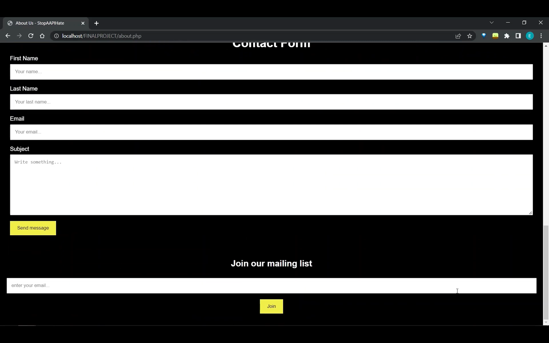
About Us Page
Documentation
We documented every step of this project on the following website: https://sites.google.com/u.rochester.edu/stopaapihate/home
Reflection
This is a passion project I've been wanting to execute for a really long time (since the spike in AAPI hate crime in 2020), so I was really excited to see this project come to life. We only had 3 months to complete this project and had to juggle it along with all our other obligations as college seniors, so there are definitely things we still want to change about our project.
Lessons
1. Leave room for multiple rounds of usability testing
2. Getting people to do things for free is hard
Next Steps
1. Conduct more than one round of usability testing
2. Add resources to educate people on how to prevent AAPI hate
3. Create a Stop AAPI Hate App (in progress)
Video Overview
Click the video above for an overview of the entire process of creating our Stop AAPI Hate website