Messaging system
Overview
My Role
Timeline
User Research
Affinity Diagram
Persona Building
Brainstorming + Evaluation
Sketching
Low-Fidelity Prototyping
July - August 2020 (4 weeks)
Tools
Team Size
Figma
Miro
Mural
Google Workspace
4
Background
In a team of four, I was given four weeks to enhance STEMAway’s messaging system experience and simultaneously learn about and practice user research and design concepts for the first time.
My Role
I was involved in all steps of the process from User Research to creating the low-fidelity prototypes, which I was in charge of creating on Figma.
Problem Statement and Goal
STEM-Away is a platform where students, junior professionals, recruiters, and market stakeholders connect and communicate. However, the current messaging system is inefficient and inconvenient, compromising its usability and intuitiveness. Our goal was to create a more user-friendly messaging system accessible from different parts of the website, including the landing page. This can compel users to use the messaging system on STEMAway rather than turning to other more popular messaging platforms.
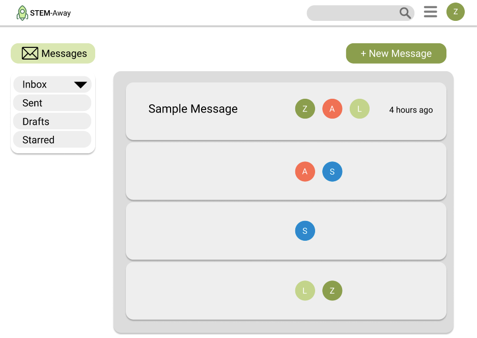
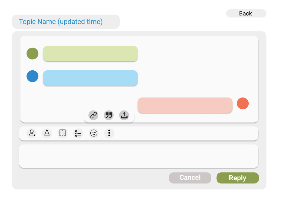
What the old messaging system looked like
The Process
1. Interviews
2. Affinity Diagrams
3. Personas
4. Brainstorming and Evaluation
5. Information Architecture and Low-Fidelity Sketching
6. Low-Mid Fidelity Prototype
Interviews
To identify users' pain points with the current messaging system, we generated interview questions and conducted interviews with two groups of people: Current users of STEMAway and people who have never interacted with STEMAway before.
Zoom Interview Screenshots
Main Observations & Key Insights from Interviews
1. Formatted similarly to email, but terminology differed from that of email and was confusing and unintuitive (e.g. “New Message” button for sending message)
2. Sending a new message required a subject line
3. Each new message required a minimum of ten characters, which compromised the messaging system’s casualness and simplicity
4. Missing some functions, such as “starring” favorite messages, sending images, “delete all”, etc…
5. Unclear and confusing how an user could send messages to a group of people
6. Doesn’t display what time the message was sent
7. No easy way to check new messages quickly or see how many new messages you received
Affinity Diagrams
We summarized the information we gathered from the interviews into individual insights and categorized them using an affinity diagram. A summary of the affinity diagram can be found in the images in the 'Brainstorming' section.
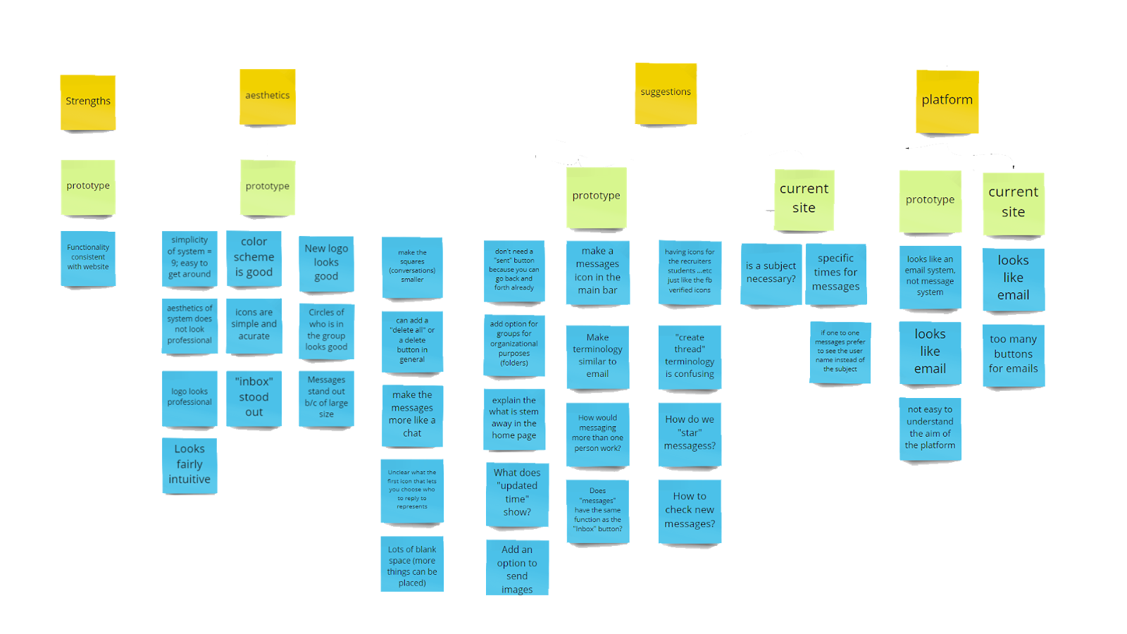
Caption: Affinity diagram categorizing feedback we received for the prototype (the system we are redesigning) as well as the original site
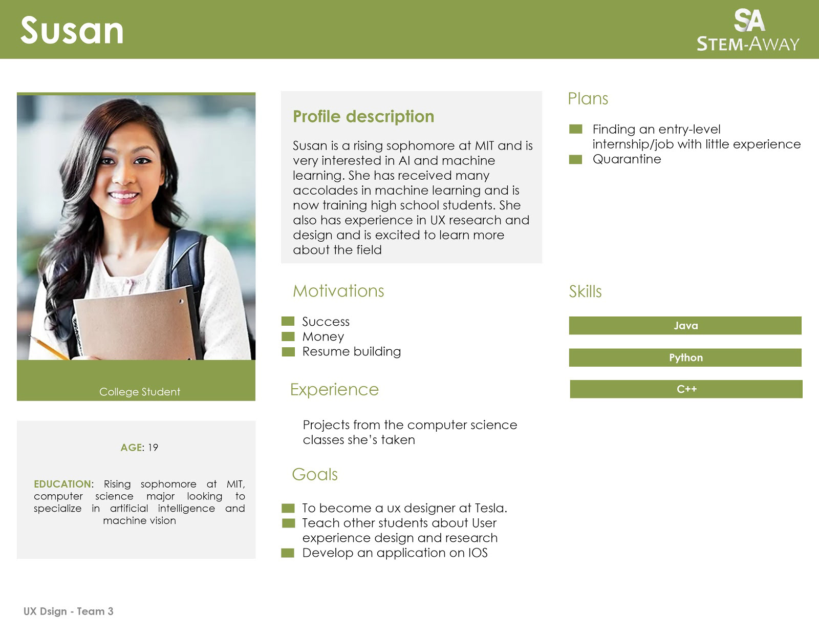
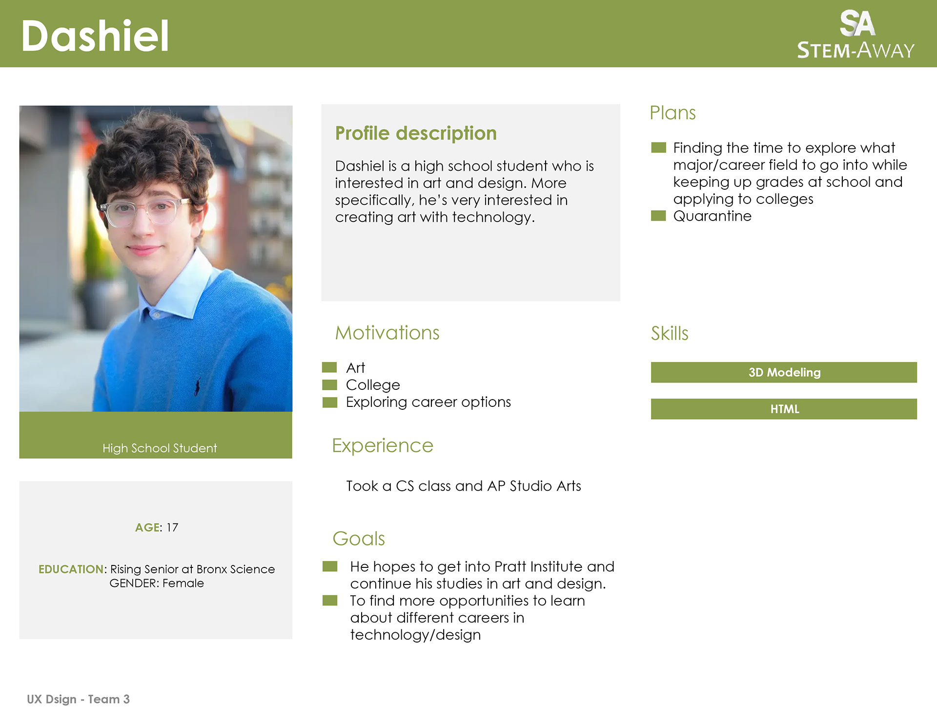
Personas
Based on all the data we collected from our interviews, we created personas to identify pain points that users of STEMAway have. Both of the personas have different experiences, interests, and skills. Our goal is to create a messaging system all STEMAway users can utilize no matter what their background is.
Brainstorming
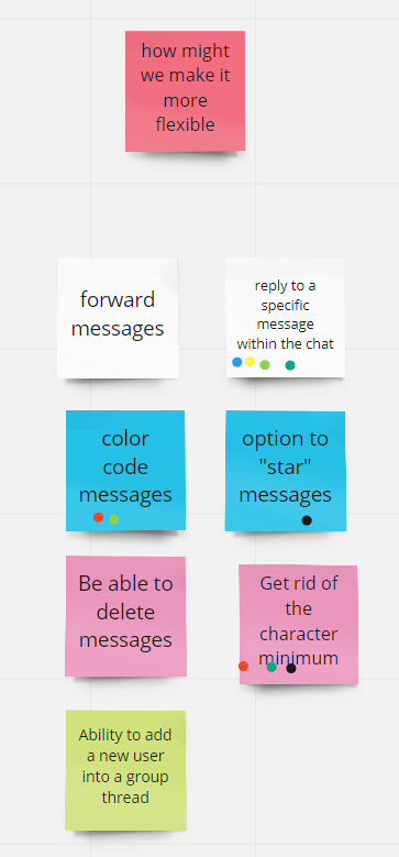
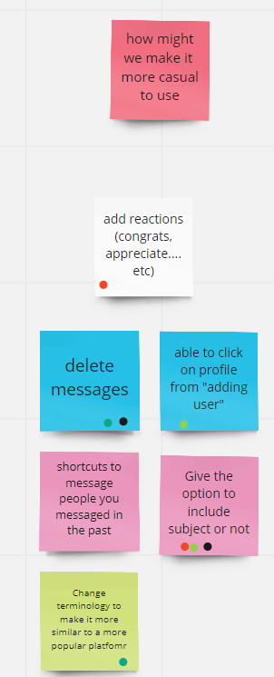
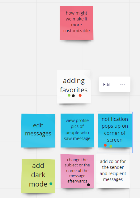
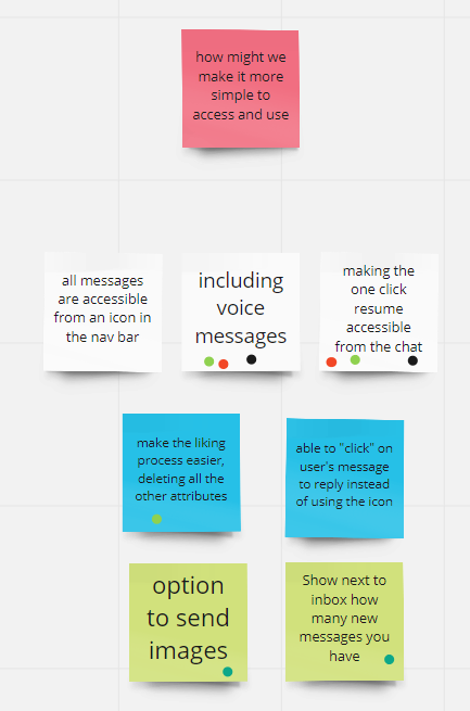
Using our affinity diagram, we pinpointed where most user pain points were and created the following “How Might We” statements:
1. How might we make the messaging system more flexible?
2. How might we make the messaging system more casual to use?
3. How might we make the messaging system more customizable?
4. How might we make the messaging system more simple to access and use?
We then brainstormed solutions that could solve each problem and used dot voting to arrive at two solutions for each problem.
Gathered all interview insights into an affinity diagram created with Mural
Evaluation
We then evaluated which solutions out of those would add the most user value and require the least effort for organization using an impact feasibility matrix. Based on this, we decided on solutions to implement in our redesign.
Solutions:
• Change to more intuitive terminology
• See number of new messages from navigation bar
• Label contacts
• Organize contacts by labels
• Access One-Click resume from chat
• Streamlined tool bar
• Removal of subject field requirement for sending a message
• Removal of character minimum for sending a message
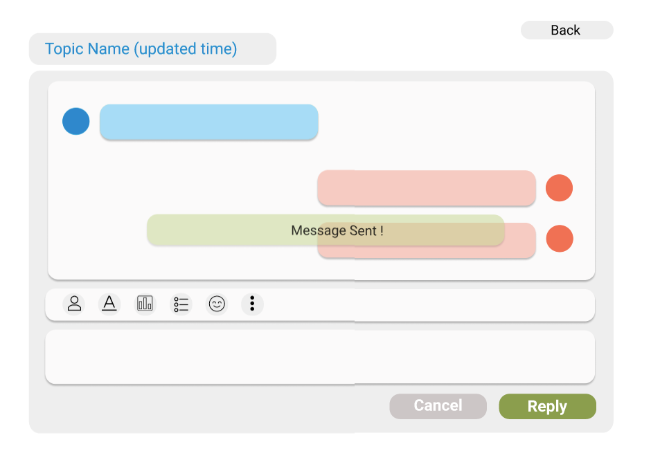
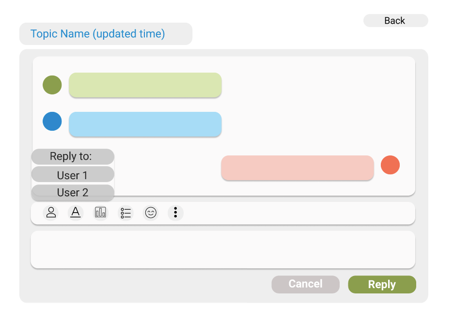
• Reply to specific message within a chat
• Dark mode
• Select "all"
• "Star" message
• Delete chat
• Mark as read/unread
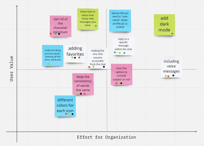
Impact feasibility matrix
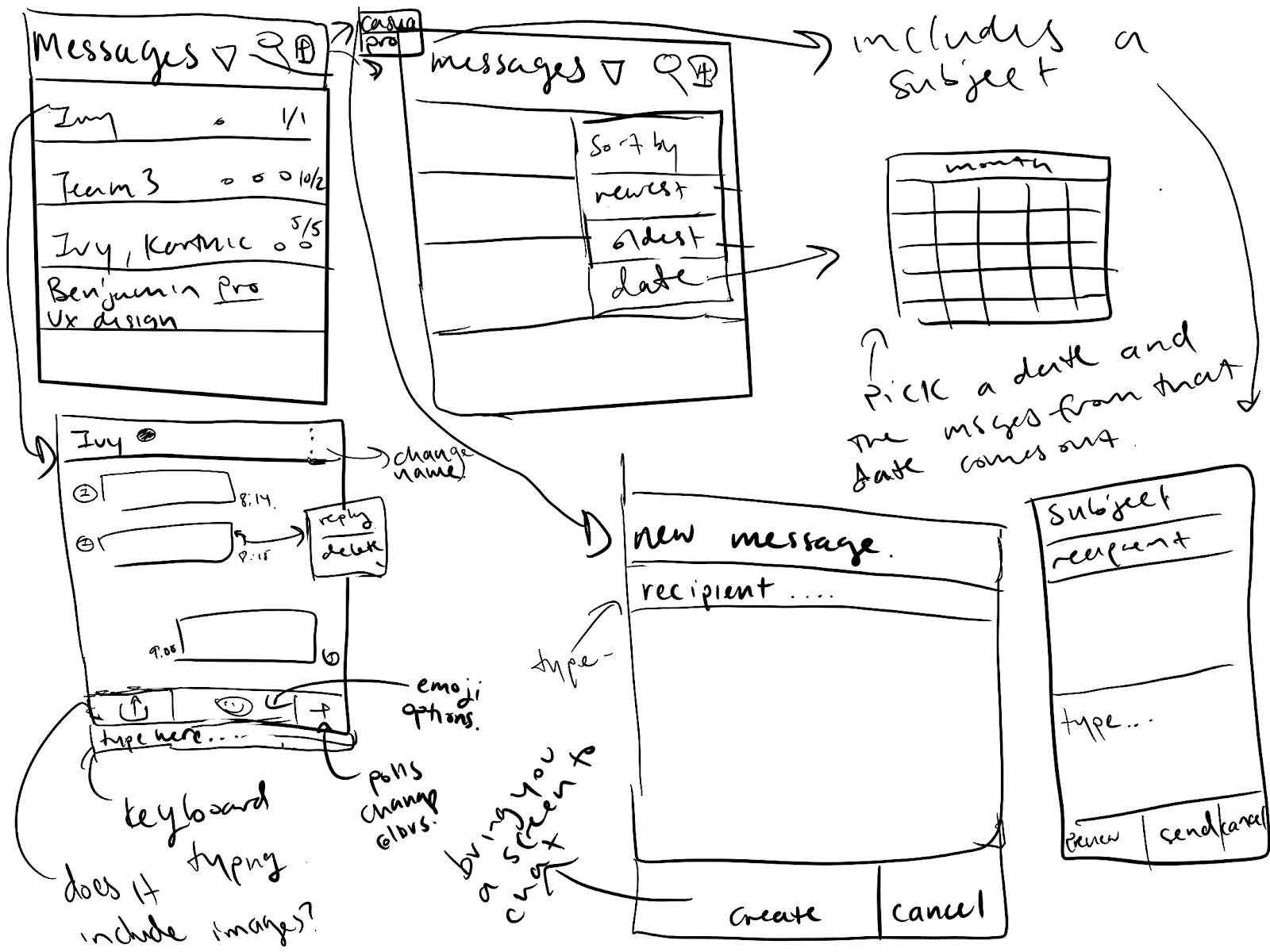
Low-Fidelity Sketching
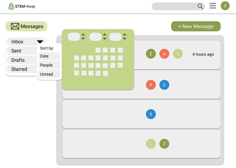
Low-Fidelity Prototype
Base Slide
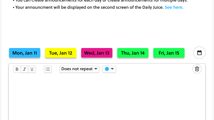
To make the messaging system more casual, we designed it to look more like an instant messaging platform and less like email. We also changed the terminology to match that of instant messaging software instead of email and made it consistent across the platform.
Solutions Implemented:
• Change to more intuitive terminology
• See number of new messages from navigation bar
• Removal of subject field requirement for sending a message
• Removal of character minimum for sending a message
• Reply to specific message within a chat
• Dark Mode
Before
How STEMAway's messaging platform looked like before
After
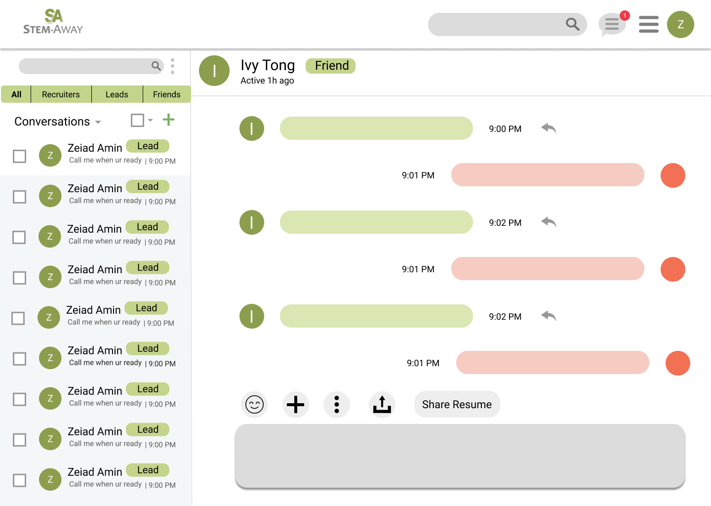
Our redesign of STEMAway's messaging platform
Tool Bar
We streamlined the toolbar to make it simpler to use by reducing the number of items in it from six to five: the emoji icon, plus icon (for opening more actions including italicizing and bolding text, adding a poll, and adding a bulleted list and numbered list), three dots icon (for changing the theme of the chat and the name of the person/group), upload icon (for uploading files and images/videos from your phone) and the share resume button, which makes the 1-Click resume easily accessible.
Solutions Implemented:
• Streamlined tool bar
• Access One-Click resume from chat
Before
How the tool bar looked like before
After
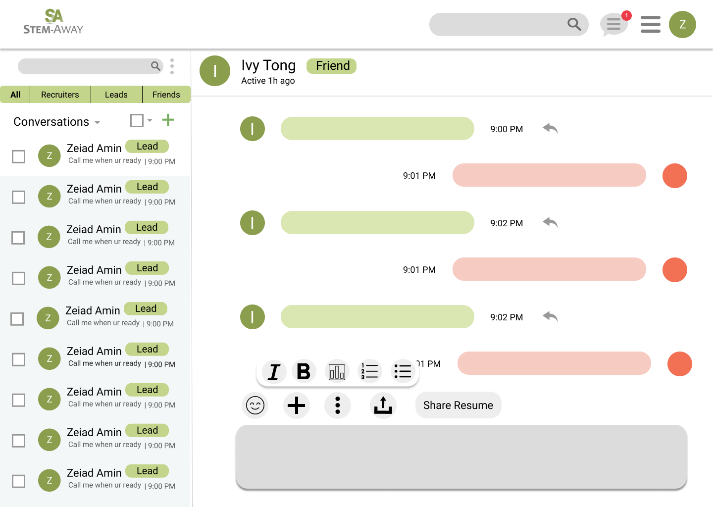
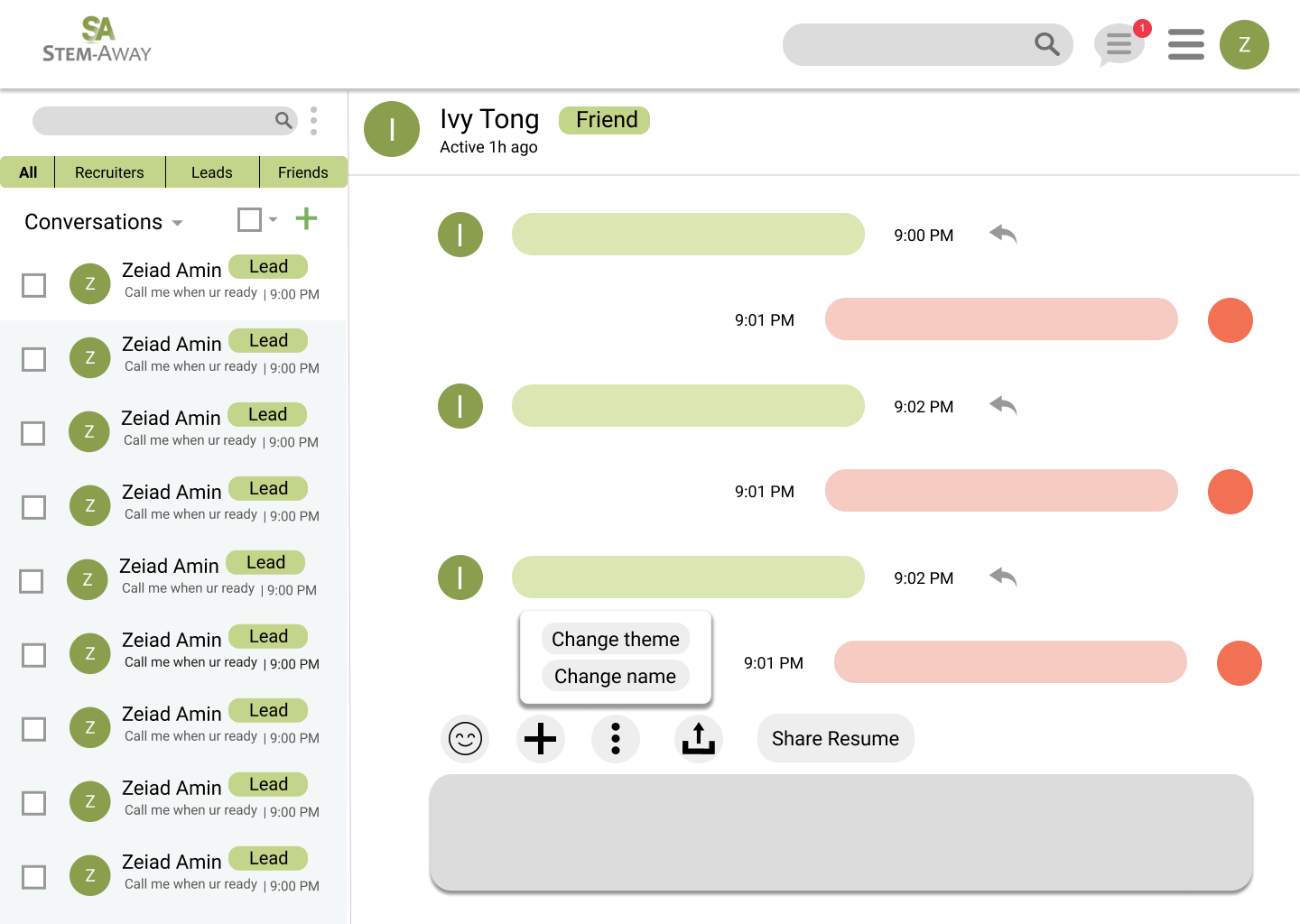
Our redesign of the tool bar
Label Button
Solutions Implemented:
• Label contacts
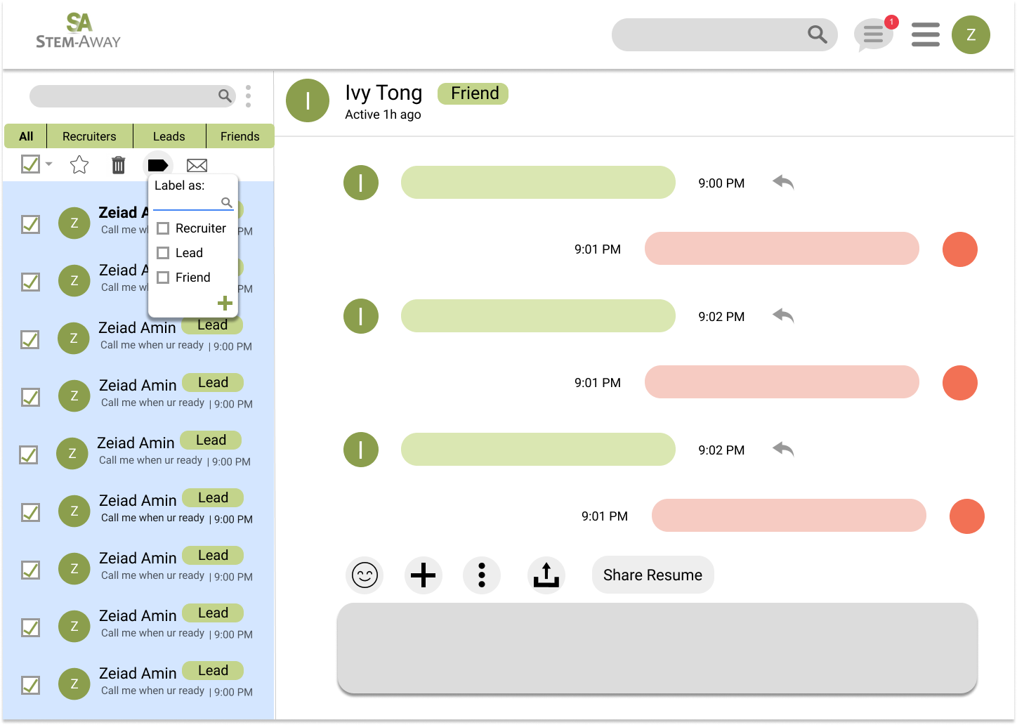
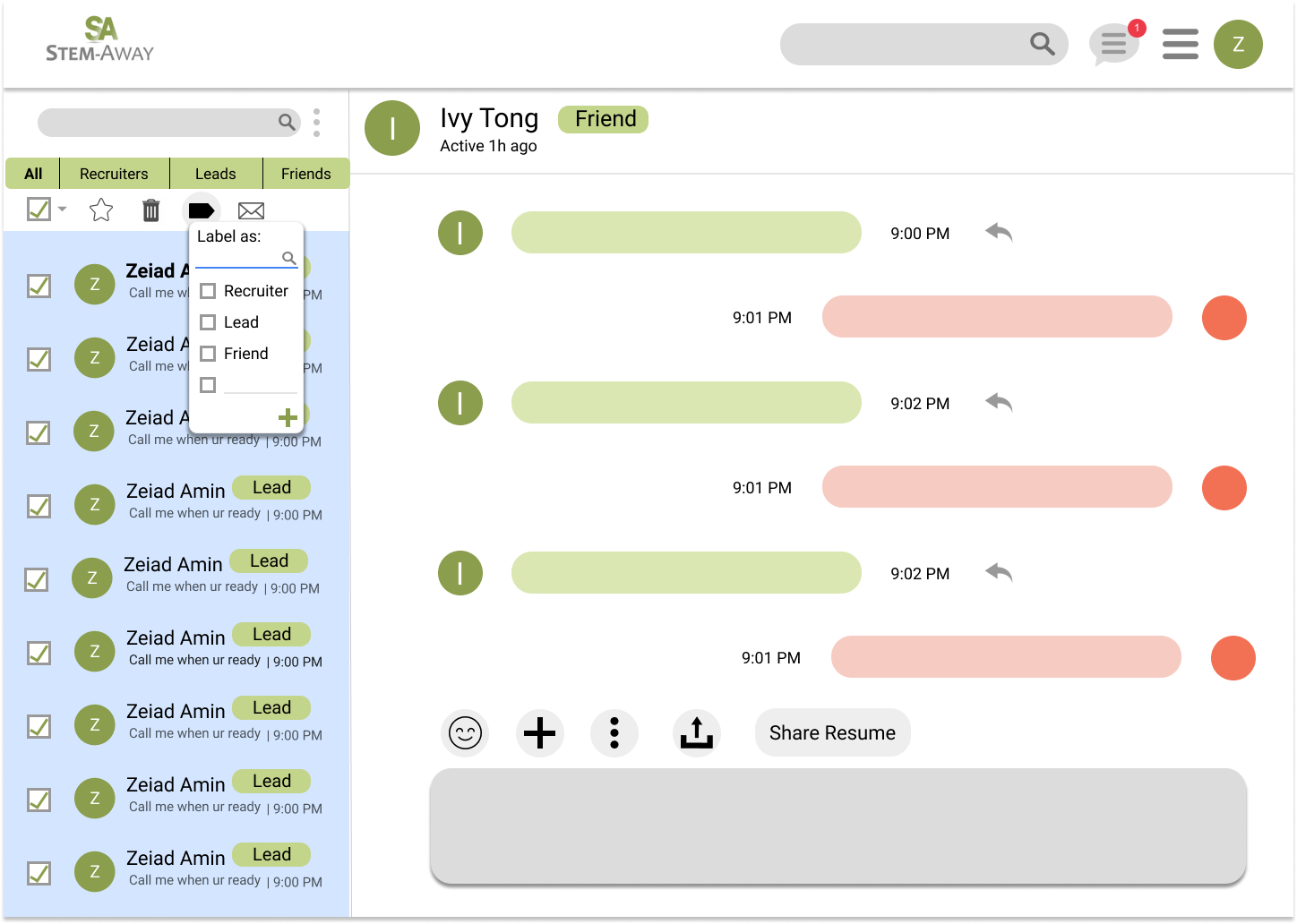
The label button allows users to either categorize emails into an existing label or create a new label. Users can categorize emails into as few or as many labels as they want.
Manage Labels
We added a feature where users can create labels—such as recruiter, friend, teammate, and lead—that they can sort and organize their contacts by.
Solutions Implemented:
• Organize contacts by labels
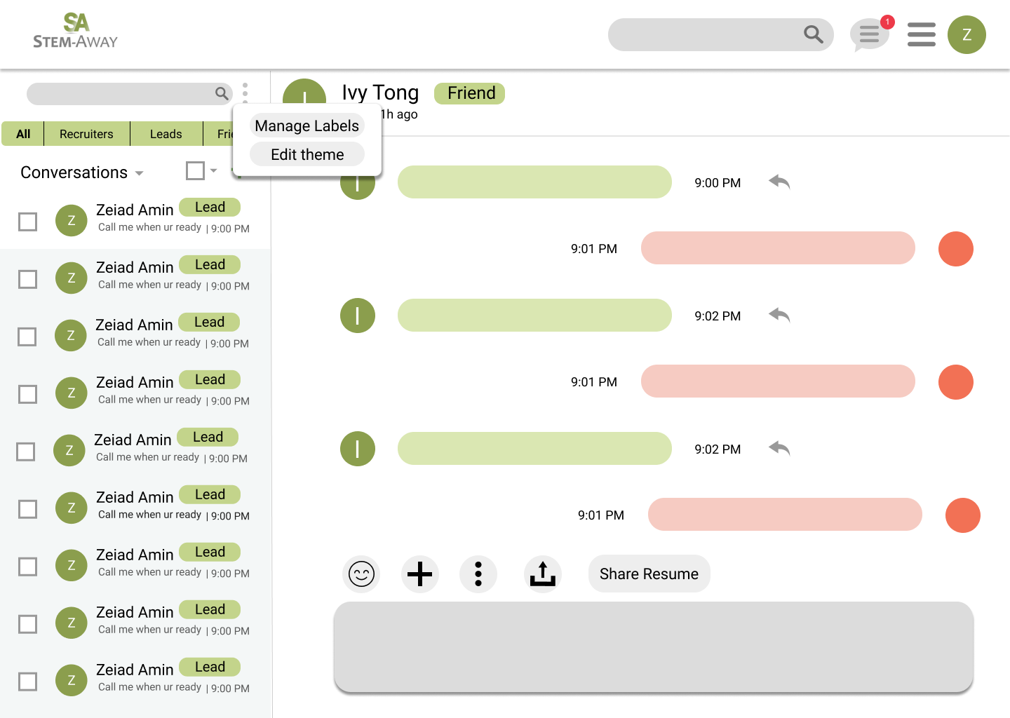
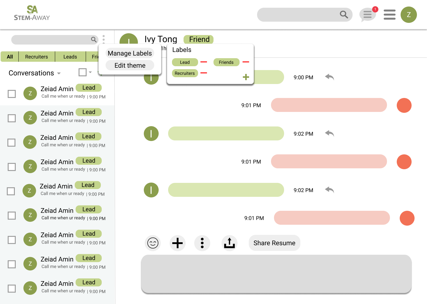
The "Manage Labels" button allows users to add or delete labels
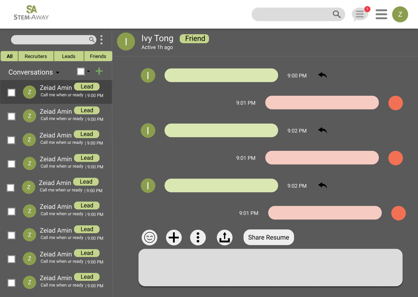
Select All Button
Solutions Implemented:
• Select "all"
• "Star" message
• Delete chat
• Mark as read/unread

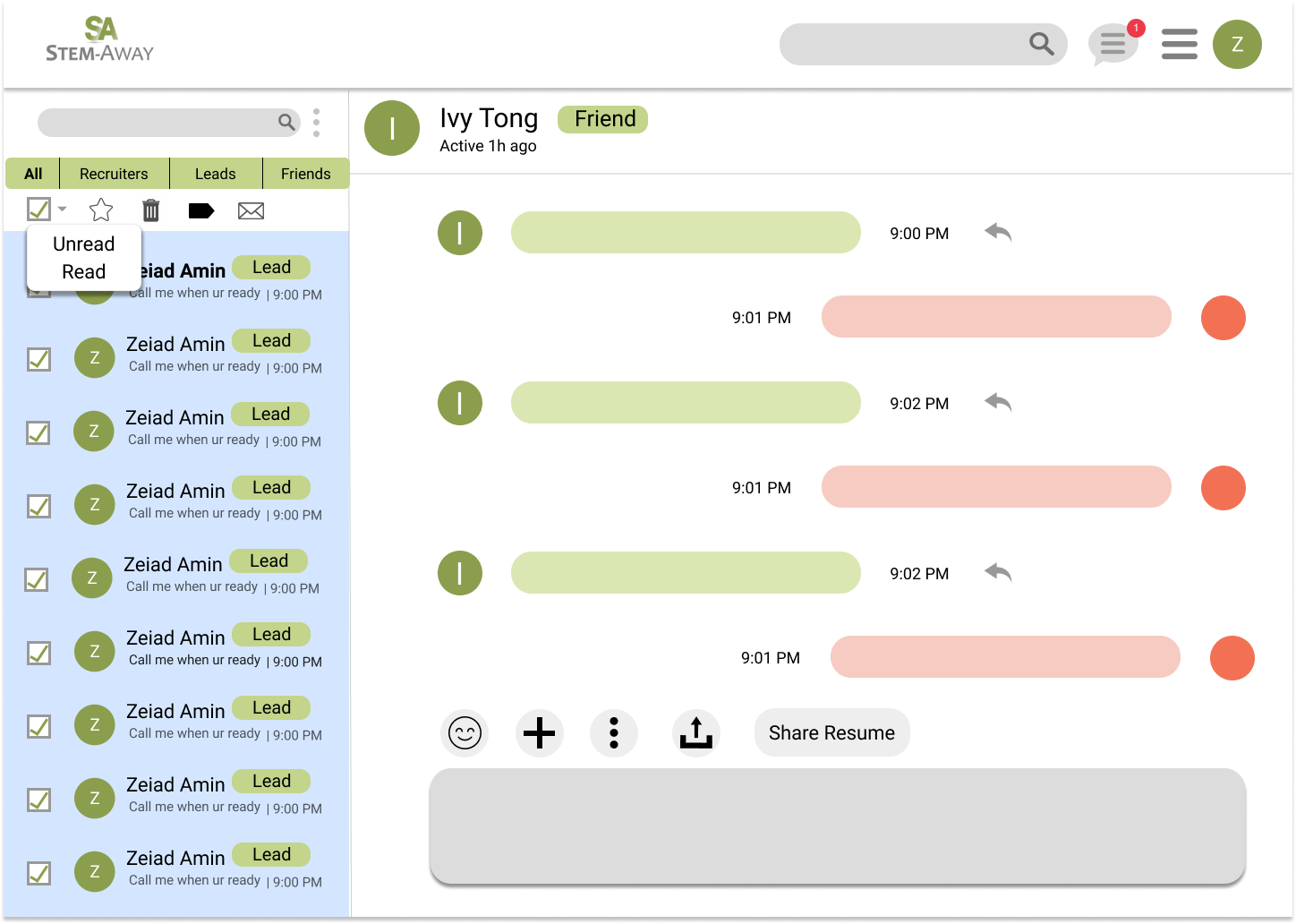
The Select "all" button allows users to star, delete, label or mark messages as "Unread"/"Read"
Reflection
This was my first time working remotely in a product design team as well as my first time working in a start-up. I enjoyed my experience so much that afterwards I decided I wanted to pursue product design as a career.
Lessons
1. I love working in small teams
2. I love the flexibility that comes with working remotely
3. I love having lots of creative freedom when working on projects
4. Communicating and defending your designs, especially to non-designers, is essential to the job of product designer